Butternut wait to update!
If you had been wishing for a wider range of fall vegetables to show up in Veggie Faces, then wait no more! Version 1.1 is in the Messages App Store now. In addition to new vegetables, there are new eyes and mouths, for an even greater range of vegetable expression. The eyes and mouths now scale nicely to the vegetable you choose - no more dangling grin on the skinny carrot, while the tomato and potato have lots of room for expressing their feelings.
Veggie Faces is still free, still in the Messages app store, and totally ready for Halloween and the fall season. Get your copy today!

Orange you pumped for Halloween? Impress your friends with a-corny veggie pun!
  Our vegetables are gourd-ous!
Veggie Faces is still free, still in the Messages app store, and totally ready for Halloween and the fall season. Get your copy today!
Orange you pumped for Halloween?
Impress your friends with a-corny veggie pun! Our vegetables are gourd-ous!New Messages App - Veggie Faces!
Little Potato Software is excited to announce its new interactive Messages app - Veggie Faces! The app that lets you express yourself through produce.
Like all developers, I watched in amazement at WWDC as they built Messages sticker apps with NO CODE. However, the full fun of sticker apps didn’t really hit me until multiple members of my family had updated to iOS 10. We couldn’t get enough of sending wacky images and memes back and forth.
Given that my company is named Little Potato Software, it only seemed natural that to do something with potatoes. Potatoes with faces! Other vegetables with faces! And the idea grew from there.
Veggie Faces isn’t a static sticker pack app. Instead, you choose your vegetable, and then the eyes and mouth that will fully express your feelings at the time. Created veggies are saved for future use, and can be sent as-is in a text message, or “stuck” to other messages.
You can be happy that you weren’t a member of my family during testing. During that time, random vegetables with faces would show up on texting conversations, whenever I forgot to just text myself during testing! Instead, download the app and send smiling vegetables intentionally!
Veggie Faces is free on the App Store today. In the future, I’ll add more vegetables, and may add an in-app purchase option for fruit. When you are using the app, you can vote for the next vegetable that will be added. I am enjoying taking photos of vegetables in plain backgrounds way more than I thought I would. I plan to go on some scouting trips to Whole Foods, looking for the perfect ear of corn soon!
Learn more about Veggie Faces
Favorite Tools Today
09/22/16 04:46 PM
Just a quick note on a set of tools that worked well for me today! Maybe these will help you tackle coding or design problems you’re facing as well.
Today was “update the icon” day for my new app. iTunes Connect wouldn’t let me submit to TestFlight without having full icon info, so it was time to put a bit more effort in to get a consistent set of images.
First, let me just say that there are Way Too Many forms of icons. This new app is a Messages app, which brings along a whole new set of sizes. I’ve also been working on an app that has a Watch extension, so there’s a third set of new sizes and shapes to deal with.
I had to use Adobe Illustrator to open some stock image files that I had downloaded long ago. I signed up for the free trial, and off I went. Man, is Illustrator complicated. Just to be able to inspect the properties of a given layer (after I had somehow managed to select it) was a challenge. I couldn’t export to SVG fast enough and move everything over to Sketch. That process did not go that smoothly - not sure if it is Illustrator’s fault for exporting bad SVG code, or Sketch’s problem in reading it. Nothing that can’t be fixed by hand though.
I learned an important lesson about drop shadows. All of the shadows in the Illustrator file looked great, no matter the background, but when exported to PNG, or even SVG, they had an annoying white halo around the shadow. It turns out they were getting a translucent drop shadow by using the Multiply mode on the layer. This is awesome if you stay in Illustrator, or can export to a fixed background. Not great if you want an alpha-enabled PNG file that can go over any background. That was a few hours of my life wasted. I was super impressed by the amount of configurability in Illustrator - you could make some really awesome and detailed gradients there. It was harder to reproduce them in Sketch that I had anticipated. I first went with a Gaussian-blurred background layer, before watching this cool video from Invision and realizing that “Outer Shadow” was a much better option (head smacking moment, there).
So, day two of icon fun, and things went more smoothly. I wanted to add some of my own artwork, so I photographed some potatoes (it IS Little Potato Software, after all!) on a white background, and used Acorn’s Instant Alpha tool to magically whisk away the background. I had just upgraded to Acorn with their current sale, and I can say I am super impressed. It feels really fast and responsive, and its online help (including videos!) is great. Anything I wanted to try, there was an easy, and obvious way, to make it work. Even though I haven’t used Acorn for probably years, it felt incredibly natural and easy. Score another one for the non-Adobe software camp.
Back into Sketch I went, and I finally got to try out the Runner plug-in. I feel like I’m just scratching the surface with this tool, which lets you do almost everything in Sketch from the keyboard, but it was great at quickly centering objects on artboards.
And last, but not least, if you’re looking to make sure you’ve got all of your icon bases covered, I’ve enjoyed using this template from Savvy Apps. It uses symbols and artboards in a clever way. I had to update it for Messages icons, but it felt like I was following a good process, not just hacking them together on my own. For Messages (and iOS in general) icon sizes, Apple supplies a nice set of templates (for Photoshop only). I also tried using this template for Messages icons, which worked well. However, since you need to have the full set of icons for the regular app as well, it made sense to keep everything in one template file.
Once I get back to coding the app, I going to try this cool Sketch Messages app template. I probably will tomorrow as I attempt to design more UI, and want to make sure it all fits!
I almost forgot to mention the Sketch Measure plugin! [https://github.com/utom/sketch-measure] Remember to hold down option when trying the various features, but it did exactly what I wanted - showed me the distance between the edges of an artboard and an object, either as pixels or *percentages*. I love the fantastic plugin community building up around Sketch.
Just a happy developer — all opinions are my own and I wasn’t paid/asked to write any of this :)
The Big Switch
08/30/16 11:58 AM Filed in: Development | iOS
On my latest project, I am trying my hand at a simple app that also has an Apple Watch component, plus a Today Extension. It has been an interesting process, to say the least.
I started off with Cocoapods, since that has worked well for me in the past. I don’t use a huge amount of third-party code, but sometimes it’s really nice to have a souped-up NSDate class, or use SnapKit for some AutoLayout goodness. However, when starting to deal with a combination of Swift, Watch extensions, and Today extensions, plus third party libraries, I had a huge amount of trouble to get Cocoapods to build things in a way that made the App Store submittal process happy. Everything worked just find during development, but getting the Frameworks directory set up just so (delete it, no, fill it, no wait, now the Swift libraries are missing! Argh!) was incredibly frustrating. Frustrating enough that I considered looking into Carthage instead.
I’ve been aware of Carthage, really just as “A dependency manager that isn’t Cocoapods”, but in reading about its simpler approach, I thought it might help avoid the problems I was encountering. And, tl;dr, it did. I feel like my builds are faster, simpler, and more under my control. I think when starting off on a new project, or each time you add a new third party framework, there’s a bit more work, rather than just running “pod install”. And the changes you need to make to your XCode project file are fairly well documented, but not entirely complete when it comes to Watch and Today extensions. But, it ultimately did work, and is more sustainable going forward.
I was lucky that almost all of my CocoaPods were already Carthage-compatible. Only one, Matthew York’s DateTools, wasn’t. DateTools was a bit of fun, since I needed to make it WatchOS and Carthage compatible, plus it’s Objective-C, so I had to make sure its API was available to my apps. All doable, and I’ve got a lovely GitHub fork with the changes if you’re interested (littlepotatosoftware/DateTools), but it was a whole new skill set I needed to learn.
I still haven’t re-introduced the Reveal library to my project. Honestly, haven’t needed it for the past few days while I dealt with built and submission issues. But now I will be using the command line linker arguments to bring it in, instead of using a Pod, so it’s only there for the Debug build. One of my app submission rejections was because I had forgotten to remove it, or at least make it conditional on the debug build, in my Podfile.
I have enjoyed using CocoaPods, and think they do great work, especially they website for Pod discovery. I’ll continue to use it for that, but will stick with Carthage for now. When CocoaPods added their new structure with named targets being required, it felt like any time I made a change to my XCode project file, I risked breaking something in the build of the pod files. And although my pods never change, it always felt like I was spending a fair amount of time every build cycle at least looking through all of the pod sources. Builds feel snappy now.
I tried to document the process as best I could, and may write something up in the future with more detail. The problem with configuration management, and app submission in general, is that you do it just infrequently enough (or at least, I do), that you tend to forget the little details and gotchas. I tried to keep a more accurate log of actions tried this time, to help save myself the cost of relearning it all the next time I have to go through the process.
I also am using fastlane (which I used on Tarrific), and find that it continues to get better and better. It is even happier now that I’ve gotten my framework linking issues taken care of!
Adding color palettes to XCode
06/29/16 11:18 AM Filed in: Design | Development
I like to put together a color scheme for my apps in Sketch. It’s got a great ability to save the document colors in the color picker window, making it easy to refer to your palette as you design. However, I wanted an easy way to get those colors into XCode.
I’ve come up with a workaround for now. It works at the moment because I have a relatively limited set of colors I want to share, and I’m not planning on changing them too much at this point.
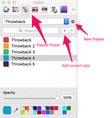
In the standard macOS color picker, you can choose the “Color Palettes” color picker (third from the left, at least on my computer). Most of the time this is set to “Apple” or “Web Safe Colors”. However, you can create your own palette using the gear button, rename it to something relevant, and then add your app’s colors to this palette. I found the easiest way to do this in Sketch is to use the “Show Colors” menu item under the “View” menu. This brings up the floating Apple Color picker. Load up with Sketch color picker, and every time you change the color in the Sketch picker, it will update the color in the Apple picker. You can then use the + button to add the current color, changing the name if you’d like. I did need to restart XCode to make it recognize the new palette, but now all of my app’s colors are in XCode, ready to be applied to UI elements in Interface Builder.
Simple trick, but handy.
I’ve come up with a workaround for now. It works at the moment because I have a relatively limited set of colors I want to share, and I’m not planning on changing them too much at this point.
In the standard macOS color picker, you can choose the “Color Palettes” color picker (third from the left, at least on my computer). Most of the time this is set to “Apple” or “Web Safe Colors”. However, you can create your own palette using the gear button, rename it to something relevant, and then add your app’s colors to this palette. I found the easiest way to do this in Sketch is to use the “Show Colors” menu item under the “View” menu. This brings up the floating Apple Color picker. Load up with Sketch color picker, and every time you change the color in the Sketch picker, it will update the color in the Apple picker. You can then use the + button to add the current color, changing the name if you’d like. I did need to restart XCode to make it recognize the new palette, but now all of my app’s colors are in XCode, ready to be applied to UI elements in Interface Builder.
Simple trick, but handy.
