iOS
Butternut wait to update!
10/25/16 11:51 AM
If you had been wishing for a wider range of fall vegetables to show up in Veggie Faces, then wait no more! Version 1.1 is in the Messages App Store now. In addition to new vegetables, there are new eyes and mouths, for an even greater range of vegetable expression. The eyes and mouths now scale nicely to the vegetable you choose - no more dangling grin on the skinny carrot, while the tomato and potato have lots of room for expressing their feelings.
Veggie Faces is still free, still in the Messages app store, and totally ready for Halloween and the fall season. Get your copy today!

Orange you pumped for Halloween? Impress your friends with a-corny veggie pun!
  Our vegetables are gourd-ous!
Veggie Faces is still free, still in the Messages app store, and totally ready for Halloween and the fall season. Get your copy today!
Orange you pumped for Halloween?
Impress your friends with a-corny veggie pun! Our vegetables are gourd-ous!New Messages App - Veggie Faces!
10/05/16 02:20 PM
Little Potato Software is excited to announce its new interactive Messages app - Veggie Faces! The app that lets you express yourself through produce.
Like all developers, I watched in amazement at WWDC as they built Messages sticker apps with NO CODE. However, the full fun of sticker apps didn’t really hit me until multiple members of my family had updated to iOS 10. We couldn’t get enough of sending wacky images and memes back and forth.
Given that my company is named Little Potato Software, it only seemed natural that to do something with potatoes. Potatoes with faces! Other vegetables with faces! And the idea grew from there.
Veggie Faces isn’t a static sticker pack app. Instead, you choose your vegetable, and then the eyes and mouth that will fully express your feelings at the time. Created veggies are saved for future use, and can be sent as-is in a text message, or “stuck” to other messages.
You can be happy that you weren’t a member of my family during testing. During that time, random vegetables with faces would show up on texting conversations, whenever I forgot to just text myself during testing! Instead, download the app and send smiling vegetables intentionally!
Veggie Faces is free on the App Store today. In the future, I’ll add more vegetables, and may add an in-app purchase option for fruit. When you are using the app, you can vote for the next vegetable that will be added. I am enjoying taking photos of vegetables in plain backgrounds way more than I thought I would. I plan to go on some scouting trips to Whole Foods, looking for the perfect ear of corn soon!
Learn more about Veggie Faces
The Big Switch
08/30/16 11:58 AM
On my latest project, I am trying my hand at a simple app that also has an Apple Watch component, plus a Today Extension. It has been an interesting process, to say the least.
I started off with Cocoapods, since that has worked well for me in the past. I don’t use a huge amount of third-party code, but sometimes it’s really nice to have a souped-up NSDate class, or use SnapKit for some AutoLayout goodness. However, when starting to deal with a combination of Swift, Watch extensions, and Today extensions, plus third party libraries, I had a huge amount of trouble to get Cocoapods to build things in a way that made the App Store submittal process happy. Everything worked just find during development, but getting the Frameworks directory set up just so (delete it, no, fill it, no wait, now the Swift libraries are missing! Argh!) was incredibly frustrating. Frustrating enough that I considered looking into Carthage instead.
I’ve been aware of Carthage, really just as “A dependency manager that isn’t Cocoapods”, but in reading about its simpler approach, I thought it might help avoid the problems I was encountering. And, tl;dr, it did. I feel like my builds are faster, simpler, and more under my control. I think when starting off on a new project, or each time you add a new third party framework, there’s a bit more work, rather than just running “pod install”. And the changes you need to make to your XCode project file are fairly well documented, but not entirely complete when it comes to Watch and Today extensions. But, it ultimately did work, and is more sustainable going forward.
I was lucky that almost all of my CocoaPods were already Carthage-compatible. Only one, Matthew York’s DateTools, wasn’t. DateTools was a bit of fun, since I needed to make it WatchOS and Carthage compatible, plus it’s Objective-C, so I had to make sure its API was available to my apps. All doable, and I’ve got a lovely GitHub fork with the changes if you’re interested (littlepotatosoftware/DateTools), but it was a whole new skill set I needed to learn.
I still haven’t re-introduced the Reveal library to my project. Honestly, haven’t needed it for the past few days while I dealt with built and submission issues. But now I will be using the command line linker arguments to bring it in, instead of using a Pod, so it’s only there for the Debug build. One of my app submission rejections was because I had forgotten to remove it, or at least make it conditional on the debug build, in my Podfile.
I have enjoyed using CocoaPods, and think they do great work, especially they website for Pod discovery. I’ll continue to use it for that, but will stick with Carthage for now. When CocoaPods added their new structure with named targets being required, it felt like any time I made a change to my XCode project file, I risked breaking something in the build of the pod files. And although my pods never change, it always felt like I was spending a fair amount of time every build cycle at least looking through all of the pod sources. Builds feel snappy now.
I tried to document the process as best I could, and may write something up in the future with more detail. The problem with configuration management, and app submission in general, is that you do it just infrequently enough (or at least, I do), that you tend to forget the little details and gotchas. I tried to keep a more accurate log of actions tried this time, to help save myself the cost of relearning it all the next time I have to go through the process.
I also am using fastlane (which I used on Tarrific), and find that it continues to get better and better. It is even happier now that I’ve gotten my framework linking issues taken care of!
Introducing... Tarrific!
04/08/16 09:37 AM
One of the best things about being an independent app developer is that if you have an idea for an app that would make your life better or easier, there’s nothing stopping you from developing it, and then getting to share it with others. My newest app, Tarrific, falls squarely in that category. I love to cook, and often use a kitchen scale. The tare (or zero) button on the scale is a great way to add new ingredients to a bowl, and weigh them as you go. But, when you forget to zero out a scale first, or the scale decides to time out and turn off while you are working, you’re stuck. How much do the contents weigh? Who knows. Another common situation I found myself in was having my ingredients in a bowl, but wanting to divide them in half, or quarters, etc. Without knowing the exact weight of the contents, or remembering to zero out my scale before I added something and hoping it doesn’t turn off before I’m done, it was really hard to be exact.
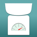 From this idea, Tarrific was created. Tarrific lets you store the weights of all of your bowls, measuring cups, dishes — anything you’d like. So, there’s a little bit of setup to do - just grab your most used bowls, weigh them, and save them in the app. Then, when you are in the middle of a big cooking project, just put the bowl and its contents on the scale, and use Tarrific to do something very simple — subtraction! If you pick a saved container, and then enter in the total weight, you’ll be given the weight of the contents. Not so fancy, really, but it can be real lifesaver when you are in the middle of a recipe, and just need to remember how many cups of flour you’ve added to the bowl (it’s about 120g a cup for most flours).
Once you know the weight of the contents, you can do something even more fun — division! Just tell Tarrific how many portions you’d like the contents divided into, and it will tell you what weight you should see on the scale as your remove each part. So, dividing the contents in half is now easy. Pick your container, enter the total weight into Tarrific, and then specify that you want two portions. You’ll then be shown the exact value the scale should display once you have removed half of the contents. I’ve found this invaluable for everything from creating evenly sized mini meatloaves to getting exactly 12 perfectly portioned muffins.
Another fun thing about the development process has been having it tested by my mom. She had been keeping a written list of the weights of her most often used bowls, just so she could subtract the weight out later. She already used an iPod touch for a kitchen timer app, so was able to start using Tarrific as well. This has been the first app of mine that she she had a real reason to use, and it has been a fun process to get her feedback on everything from the icon design to “what does that button do??”.
I’ve learned a lot through this particular app development process, and hope to share some of the new tools and techniques that I tried out on the blog over the next few weeks. For an app that is essentially something very simple (subtraction and division), I really tried to concentration on the design, keeping it simple, streamlined, and useful in the kitchen.
Preview of the tech-y details for the curious: It uses Core Data (my first app trying that out), 100% Swift, fastlane for some of the testing (brand new to me - so cool, but I’m still learning), XCode-based UI animation and unit tests (my first time trying those new tools out), cocoapods (not too many), PaintCode and Sketch for graphics (of course!), and all of the UI done in code, not in IB. That last one was a tricky choice, as an app this simple probably could have been done in IB without too much work. But, I’ve gotten used to SnapKit for Autolayout, and really like the power it gives me to tweak UI values and see all of my constraints in one place. Doing AutoLayout right makes it so much easier to support different size classes and screen sizes, including split screen on new iPads.
If you love to cook, and use a kitchen scale, I hope you’ll give Tarrific a try. It’s free in the App Store. If you really like it and find that you want to add more than four containers, there is a one-time $1 upgrade to unlock unlimited containers. I’d love to hear from you if you try it and want any new features added. Happy cooking!
View Transitions + Some Perspective
01/04/16 02:06 PM
Happy New Year!
I’m getting off to a slow start of the work week after a week off with the kids, so I decided to ease into things by stepping through a Ray Wenderlich tutorial. They are always fun to read, relatively short, and I learn something new.
The most recent non-video tutorial was:
Creating Custom UIViewController Transitions
It fulfilled my expectations in terms of better understanding view controller transitions. I still feel like there are just so many moving parts with those transitions (pun only slightly intended), but this was a straightforward enough example to have it make more sense.
But, the coolest thing I learned was just a small tidbit about perspective transforms. The tutorial has you rotate views in and out of view. It turns out that with a simple numeric constant, you can make those rotations look MUCH more realistic.
The trick is referred to here in the Apple Docs: Advanced Animation Tricks
Simply, you sent the layer.sublayerTransform 3DTransform of a parent view to have the m34 field of CATransform3D set to a relatively small negative number (it can be positive too, which appears to change the direction of a rotation). Then, when views contained inside of this container are rotated around the Y axis, they appear to recede into the distance as they spin. This is more realistic than if you didn’t set this field, because then the rotation looks more like a squeeze and expand rather than a true rotation. The value for the m34 field is a bit magical, with the tutorial using -0.002. This represents the inverse of the distance along the Z axis for the viewer, and 0.002 is about 500 pixels. Values in the range 0.001 to 0.004 seem too look fine, with larger values giving a more pronounced size change as the views spin around.
Another interesting fact about the transform is that it is applied to the container view of the views involved in the view controller transition. This container view appears to be created by UIKit to server as a safe place to mess around with transitioning from one view to another. So, each time you perform the transition, you want to reapply the perspective transform to the container view, since it disappears once the presentation/dismissal of the view controller finishes. Interestingly, it sticks around after a new view controller is presented, and only disappears once the presented view controller is dismissed. So, you are applying a transform to a view that already has one, but since this isn’t additive, it is not a problem.
So perspective transforms are neat things to know about it you want to make your y-axis rotations (and presumably x-axis too - I tried to do an x-axis rotation, but the newly presented view kept jumping in from of the existing view before the rotation had completed. But the rotation looked a lot nicer with the perspective enabled).
I may try to take this transitioning to the next level, and see how custom transitions inside of navigation and tab bar controllers can be implemented.
Happy rotating!
Shrinking Swift Arrays
09/17/15 04:12 PM
I’m really moving ahead with a new project (for tvOS!) and writing it entirely in Swift. On basically the second day of coding, I was really missing some NSArray/NSMutableArray functions from Swift Arrays, and after way more StackOverflow/Google time than it should have taken, here’s a version of removeObject that seems to compile:
Note also that the
Enjoy!
Note also that the
indexOfObject method on NSArray is replaced by the native indexOf method, so no need really to reimplement that.Enjoy!
Code Spelunking - DGRunkeeperSwitch
09/08/15 03:25 PM
This post is the first of what I hope will be many that takes a piece of software that has been released publicly (usually on github) and looks at the code to learn more about it. I always learn a lot by reading other people’s code, and thought it would be fun to take various controls, apps, etc. and break them apart and point out what I find interesting about them.
The first control I’m choosing is the DGRunkeeperSwitch by Danil Gontovnik. I learned about it from a maniacdev email this morning, and I was immediately drawn in by the smooth animation and clean lines of the control. I use Runkeeper (less regularly than I used to due to the Apple Watch), but hadn’t noticed the control until I went looking for it. It is mainly used on screens other than the “Start” tab, which is where I spend most of my time. But, I don’t love the look of the standard segmented control and switch on iOS, so the more stylish look of this control is appealing.
First thing to consider when looking at this control is that it is written using Swift 2.0, so fire up the code in the latest XCode beta. It comes with a small sample app, which is a nice touch (and typical for most controls shared on github, I’ve found).
DGRunKeeperSwitch is a subclass of UIControl.
Swift notes
General coding notes
Side Trip
I was getting an unexpected error message when running the sample app, that was due to the UIViewControllerBasedStatusBarAppearance key being specified in the Info.plist file. This key had been set to NO to allow the view controller to set the color of the text in the status bar explicitly, using the call UIApplication.sharedApplication().statusBarStyle = .LightContent. Without the entry in the plist file, it doesn’t appear that this call actually changes the status bar color. The warning may just be an artifact of a beta release, but it bothered me. The way to fix this was to remove the key from the Info.plist file, and have the root view controller manage its own status bar style. However, the root view controller is actually a UINavigationController, and it does not, by default, defer to its top view controller for its status bar style, even though that would seem to be the obvious way to handle things. You can fix this in an extension to UINavigationController, which either overrides preferredStatusBarStyle() to return the custom status bar style, or in a more general way, override childViewControllerForStatusBarStyle() to return the topViewController, which then implements prefferedStatusBarStyle() itself. This seems like the more general option, and puts the responsibility to set the status bar color in the hands of the view controller that is presenting the rest of the UI, where presumably we are attempting to match an existing UI to the status bar color. One last Swift gush - it is so easy just to add a quick extension to a system class such as UINavigationController.
I didn’t think I would explore the world of status bar style overrides and system class extensions, but you never know what you’ll learn when you dive into a new piece of code!
Possibilities
It would be interesting to see this control support @IBDesignable/@IBInspectable so that it could be configured in IB. It also could be extended to support more than two choices, making it an alternative to UISegmentedControl in addition to UISwitch.
Conclusion
Overall, a lovely little control with clearly written code that takes advantage of some nice Swift language features to implement things in a clean, streamlined way.
The first control I’m choosing is the DGRunkeeperSwitch by Danil Gontovnik. I learned about it from a maniacdev email this morning, and I was immediately drawn in by the smooth animation and clean lines of the control. I use Runkeeper (less regularly than I used to due to the Apple Watch), but hadn’t noticed the control until I went looking for it. It is mainly used on screens other than the “Start” tab, which is where I spend most of my time. But, I don’t love the look of the standard segmented control and switch on iOS, so the more stylish look of this control is appealing.
First thing to consider when looking at this control is that it is written using Swift 2.0, so fire up the code in the latest XCode beta. It comes with a small sample app, which is a nice touch (and typical for most controls shared on github, I’ve found).
DGRunKeeperSwitch is a subclass of UIControl.
Swift notes
- Liberal use of tuples for assignment. Increases compactness of the code.
- Reasonable defaults for configurable aspects of the control, using defaults for variables on the control
- Uses the deinit method to remove itself as an observer. So nice to have a well-defined place to do this!
General coding notes
- Changes the underlying layer class of a few views in two different ways. The first, expected, way is by returning a custom class from the class-level layerClass() method. When your own class wants to change its layer, this works. If you want to change the layer class for a standard view, such as UIView, then you can use the Objective-C runtime method object_setClass to change the underlying class object. This new class object updates the cornerRadius of the view based on the height of the bounds. This is done in one list as a Swift didSet on the frame property of the CALayer. (I would almost count that as a clever Swift trick, since something like this is so much simpler to do in Swift than Objective-c). Also, can you really call it the Objective-C runtime when writing in Swift? I suppose just “runtime” is more appropriate now.
- The clever thing about this control is watching the color of the text labels change as you swipe the selected “bubble” from one item to the other. This is done by having two copies of each label, stacked on top of each other. They are in contrasting colors to their background. There is a background view between these two sets of labels, which contains the selection highlight. A mask is then applied to the view containing the “selected” labels (the top set of labels), such that the selected title views under the current selection background are visible, and the ones outside the bounds of the selection view are masked out.
- Both tap and pan gestures are supported. UIView dynamics are used for a nice springy animation when switching between choices. Snapping behavior kicks in if you pan only partway.
- layoutSubviews() handles positioning the selected rectangle above the selected item (essentially either on the right or left side of the control). If the labels are too long to fit in the specified size of the control, the label spills over its background, which doesn’t look great. Truncating the labels to fit would be better than letting them flow over the bounds of the control. This could be done by just pinning the size of each label to the maximum allowed size.
- The frame of the selection view and the frame of the mask view are tied together using KVO on the frame property of the selection background view. I’m not sure this is worth it, as you could easily set both frames at the same time, instead of decoupling this. Overall, it is less code to just assign the mask in the two places where it changes, although I can understand the desire to tie the two values together with KVO so that you don’t have to worry how many times the selection view is changed - it will always update the mask when its frame changes. Definitely a design choice, and one that I think could go either way.
Side Trip
I was getting an unexpected error message when running the sample app, that was due to the UIViewControllerBasedStatusBarAppearance key being specified in the Info.plist file. This key had been set to NO to allow the view controller to set the color of the text in the status bar explicitly, using the call UIApplication.sharedApplication().statusBarStyle = .LightContent. Without the entry in the plist file, it doesn’t appear that this call actually changes the status bar color. The warning may just be an artifact of a beta release, but it bothered me. The way to fix this was to remove the key from the Info.plist file, and have the root view controller manage its own status bar style. However, the root view controller is actually a UINavigationController, and it does not, by default, defer to its top view controller for its status bar style, even though that would seem to be the obvious way to handle things. You can fix this in an extension to UINavigationController, which either overrides preferredStatusBarStyle() to return the custom status bar style, or in a more general way, override childViewControllerForStatusBarStyle() to return the topViewController, which then implements prefferedStatusBarStyle() itself. This seems like the more general option, and puts the responsibility to set the status bar color in the hands of the view controller that is presenting the rest of the UI, where presumably we are attempting to match an existing UI to the status bar color. One last Swift gush - it is so easy just to add a quick extension to a system class such as UINavigationController.
I didn’t think I would explore the world of status bar style overrides and system class extensions, but you never know what you’ll learn when you dive into a new piece of code!
Possibilities
It would be interesting to see this control support @IBDesignable/@IBInspectable so that it could be configured in IB. It also could be extended to support more than two choices, making it an alternative to UISegmentedControl in addition to UISwitch.
Conclusion
Overall, a lovely little control with clearly written code that takes advantage of some nice Swift language features to implement things in a clean, streamlined way.
Pods checkin imminent
04/08/15 10:31 PM
I just finished listening to the iPhreaks podcast, episode 97 - “Deconstructing Your Codebase with Michele Titolo”. I enjoyed the entire discussion, and especially hearing a fellow woman developer discussing the nitty gritty of managing your code base. As an independent developer, not all of the conversations were relevant. But, as I find that I work on projects over very long spans of time (approaching years for some of my earlier app releases), it’s practically as if I’m looking at someone else’s code base at times. Most of the time, this comes in the form of “what was I thinking when I wrote this?!?”. :)
However, one point that they touched on was whether or not to check your CocoaPods into revision control. I hadn’t been, but this conversation convinced me that it would be a good idea. Since I’m just running a local git repository, space or checkin times are not really an issue. And, since I’m about to release a new product, having a stable version of ALL code, not just my code, checked in and labeled for the release strikes me as a really good idea. I just recently got burned by an update to CocoaLumberjack that messed up my debugging statements, so I think having my CocoaPods checked in to my own repository will allow me to better monitor what has changed when pods are updated. I solved the CocoaLumberjack with some digging on GitHub, but it was definitely a lesson to be careful about doing random “pod update” calls, especially when you are getting close to a release.
Plus now, when I do a commit in XCode, I won’t see all those annoying ?’s showing up in my commit window. Thank you Michele, for giving me the confidence and push I needed to finally do something about my pods!
Evolution of Levels
07/01/14 04:51 PM
During my extended absence from blogging, I have been hard at work (well, mostly hard at work!) on a new iOS app. It started off as a fun exercise, and has turned into a game. One of the areas of the game I’ve reworked multiple times is the method of providing game level data. The game didn’t even really have levels, but as I played it and tested it, and played other iOS games, adding progressive levels felt like the right way to go. At first, the levels were completely hardcoded into an array of C structures. This worked to get things started. Then, I decided that being completely generated was the way to go. I wrote and entire level generator, although it had rules and parameters so each level wasn’t completely random. It worked nicely, but didn’t seem all that great for challenges between players, or replaying to improve your score. So, jumping onto the JSON train, I next specified the each level format in a JSON-based file, which I loaded at startup. This was a very pleasant format to write (much better than plists)(you can only click on those little tiny + and - icons in Xcode’s plist editor so many times before going crazy), and gave me a certain amount of flexibility. However, it just felt so heavy... all those arrays of strings. I don’t think it was a huge performance problem, but I just felt like it was heavier than I needed. So, back to C structures. But this time, just a small change in how I formatted the default entries in the header file (comments and putting each field on its own line ) made it feel like JSON, but I got back my beloved bitfields and integer-based efficiencies. One area that had pushed me toward JSON was the need to specify some help text per level. Putting ObjC strings into C structures is not really doable, but I came up with a workaround. The strings I needed for each level were written with each structure, but commented out and included an easily grep-able tag. One quick build phase where I ran some grep/sed magic over my header file and generated a .strings file, and I was in business. A great bonus is that some day I could localize the app more easily. Plus, one quick memcpy of the pre-initialized structure into heap-allocated memory meant I could have the best of both worlds -- some values computed at runtime and most values set up ahead of time in a easy-to-read and modify header file. Having things in C also makes it possible to do some debug-only startup validation of the data that would be more difficult to do in a JSON/Dictionary based solution.
Something that seemed like it should be straightforward has certainly taken me a while to figure out. This might not even be the final iteration. But, I’ve coded up the first 10 levels of the game using the new structure (and due to some good factoring in my code, the changes to support an entirely new level format were mostly hidden in one class), and it feels pretty good. One of the reasons I hadn’t finished specifying all of the levels in the game (I’d like to release with 50 levels to start), had been partly due to the cumbersome nature of adding new levels. I’m hoping that the next 40 levels go as easily as the first 10 went.
Good luck designing your own apps! Don’t be afraid to iterate and throw out something that doesn’t feel like it’s working for you. It might have cost me a few hours to rework this code, but if it means I am able to move forward in completing a part of the app that had been annoying me, then it was most definitely time well spent.
New version of iOS AlphaBaby
03/24/12 05:57 PM
Version 2.3 of AlphaBaby (and AlphaBaby Free) is now available in the App Store!
This is a small release which adds one new feature -- the ability to display more items at a time on the screen. You can now show 30, 50, or 100 items at a time, in addition to the previous choices.
Also, AlphaBaby is now only released in the Education category. I don’t think many people were finding it through the Games category, and it allows another exciting development. AlphaBaby is now available in Brazil and South Africa, as well as any other countries that didn’t allow apps in the Games category. Tell all your international friends!
Error debugging on older iPhone
12/01/10 07:58 PM
I decided to use my old iPhone 3G to do some debugging today. However, when I tried to download my app to the device, I got the cryptic error:
Error launching remote program: security policy error.
A relaunch of both the device and XCode failed to clear it up. However, a quick Google search revealed the problem. I had expired profiles on the device (along with their unexpired replacements). Apparently just having the expired profiles on the device was enough to confuse XCode and prevent it from launching the app.
I’m documenting this to myself more as a reminder that if I don’t use a device for testing for a while, looking for expired profiles should be my first step if debugging isn’t working.
Now if only I didn’t have references to iOS 4.0 APIs in my code, perhaps I’d be running on my iOS 3.0-based 3G without any problems!
